Demo -Angular Projects
Overview
Select image for more details, or scroll down for full details.
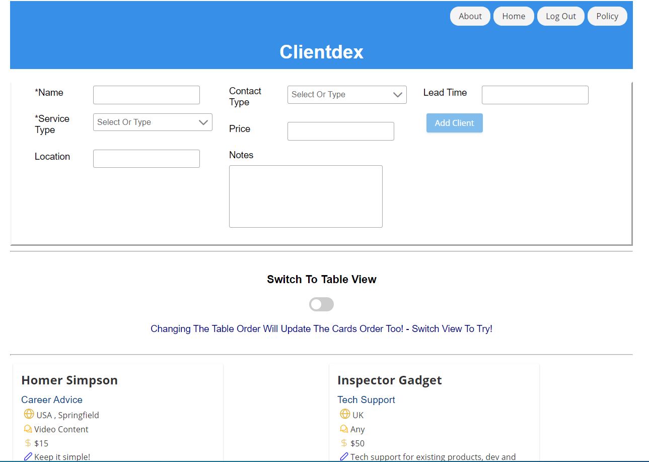
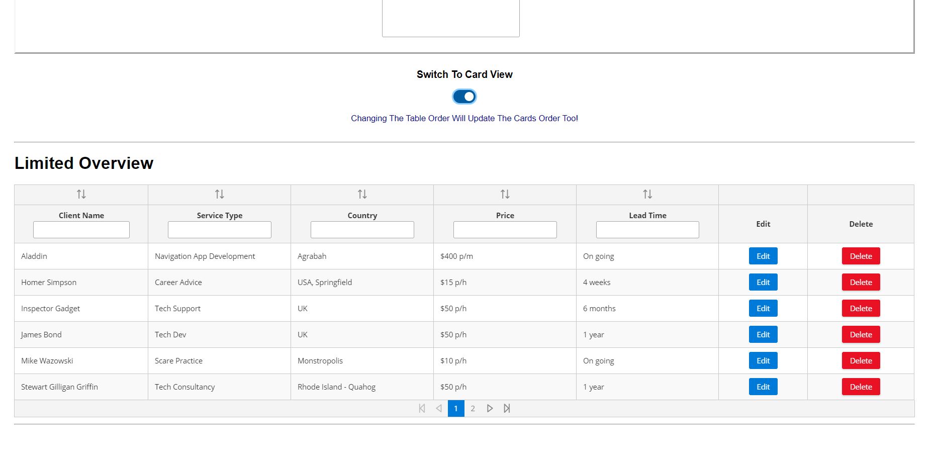
Clientdex
With the old Rolodex in mind, this app is a simple Client-info version called Clientdex. Built with Angular, Firebase backend and UI Components from PrimeNG.
https://client-index-8bc94.firebaseapp.com
Key Features
- Firebase Back End
- Login With Google
- Auth Required For CRUD – for signed in account
- BehavourSubject With Mock Data – for sample data only (no login needed)
- UI component from PrimeNG
- Additional styling in css
- Project Version Control – Git
- Project Working Files Storage – Bit Bucket
- ConfirmDialog – to confirm delete client action
- Custom faveicon
- SEO – Title | Meta Tags confirm delete client action
- Firebase custom URL for hosting
- Produce text content for Policy section
Data
- Interface Implementation – Client
- Account Data – Firebase Firestore With Auth Only CRUD
- Sample Data – Behaviour Subject – Init Data | Changes Published To Subscribers
- Auth Guard – Logged In Clients Page
- Firebase Firestore Read/Write Rules Applied
Forms
- Client Entry Form – Template Driven
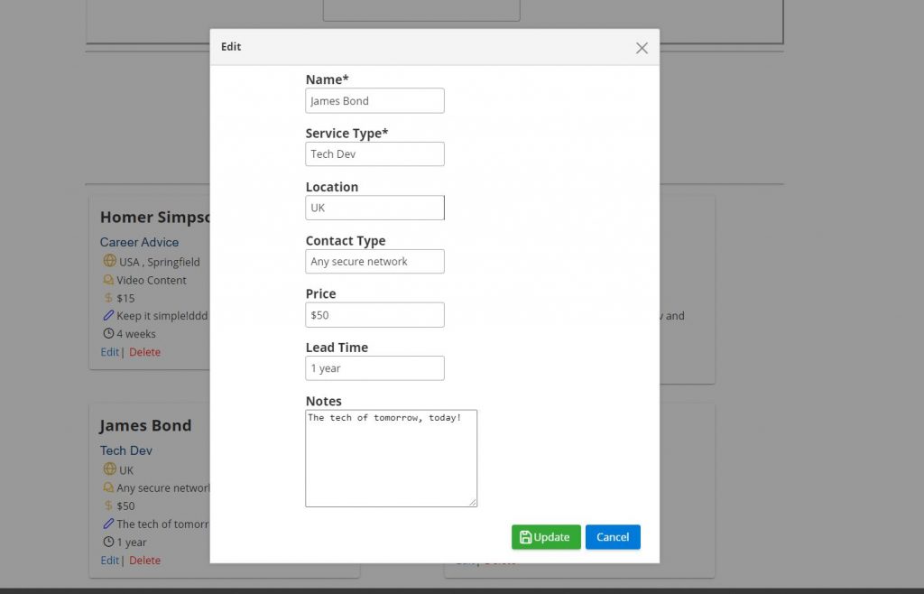
- Client Edit Form – Reactive Form
- DynamicDialog Implementation- From Card/Table View →Dynamic Dialog Form View
- Form Validation
Bulgarian By A Brit
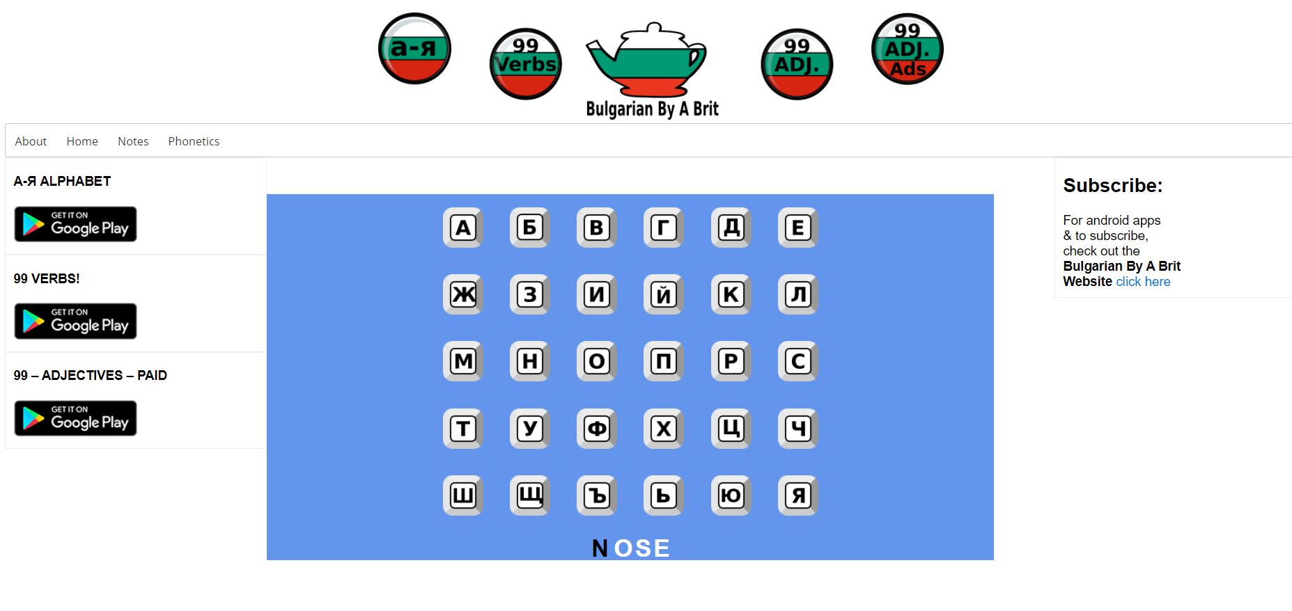
Bulgarian By A Brit have previously released Android apps. This demo web app takes their alphabet app (albeit more limited in content) and offers users a web version.
https://bulgarian-by-a-brit-alphabet.firebaseapp.com
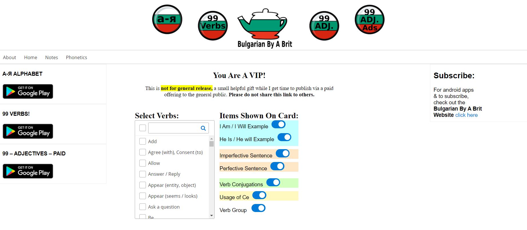
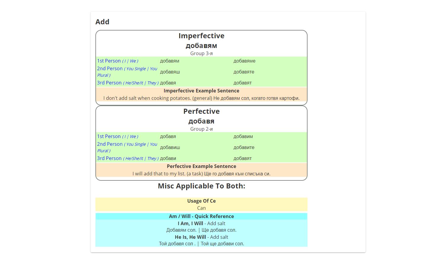
I also recreated the 99 Verbs app, please get in touch for a demo of this, pictures are included below:
Key Features
- Left and right side areas for marketing content
- Phonetics: Cyrillic alphabet
- Each letter shown as a button
- Button clicked reveals the English word phonetics
- Phonetics text shows on top for smaller screens
- Vebs: using 99 verbs worth of data, provide:
- Selection list (with search option and multi select option)
- Each verb selected will show on a card
- The user can reduce the amount of info shown on the cards, tailored to their preference
- Built for viewing on bigger screens
- Images scale for smaller screen
- UI component from PrimeNG
- Additional styling in css
- Project Version Control – Git
- Project Working Files Storage – Bit Bucket
- Custom faveicon
- Menu items: About | Home | Notes | Phonetics
- Protect content: no right click or copy of the VIP area (see /vip added on main url )
- VIP not added to the main menu – this will be a paid offering at a later date
Data
-
Data started as a spreadsheet
- CSV to Json
- VIP component imports the data.json
- Input switches preference bound via ngModel and shown/hidden based on *ngIf
To Do App – build to spec.
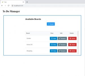
This app was built to spec. Just for demo purpose, someone else gave me the spec I then created it. I thought it is interesting to see how someone delivers to a given spec. Code available upon request.
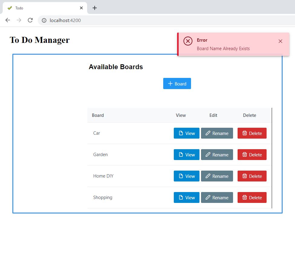
- Create a board(s) (i.e. homework, garden, car, etc.)
- Rename the board
- Delete the board
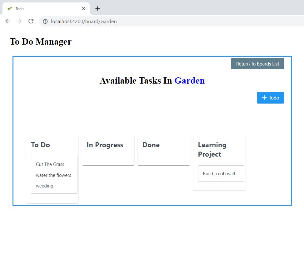
- Each board has 3 “cols” by default – To Do | In Progress | Done
- To be able to add new “cols”, remove if not in use
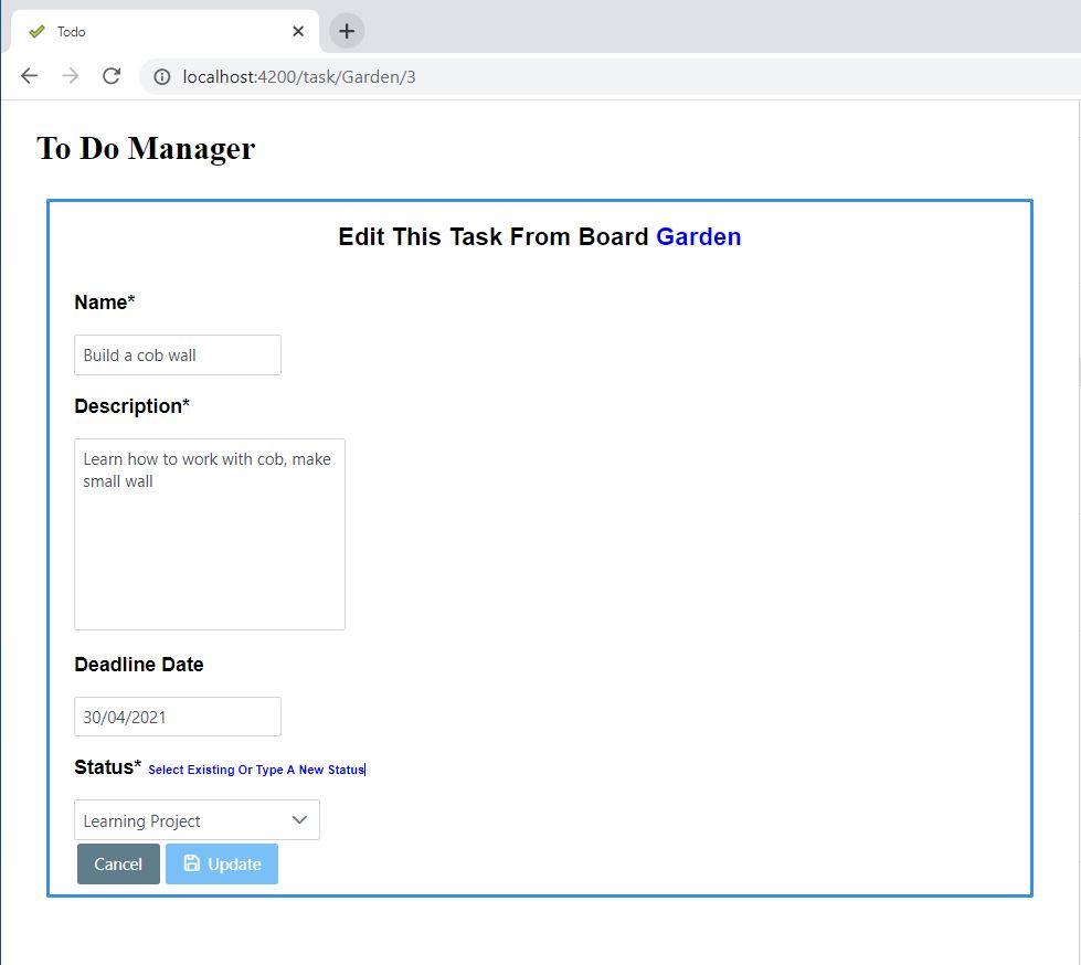
- Each task to inc. name, description, date created (auto gen.), optional deadline date
- Each “col” to show just the task name
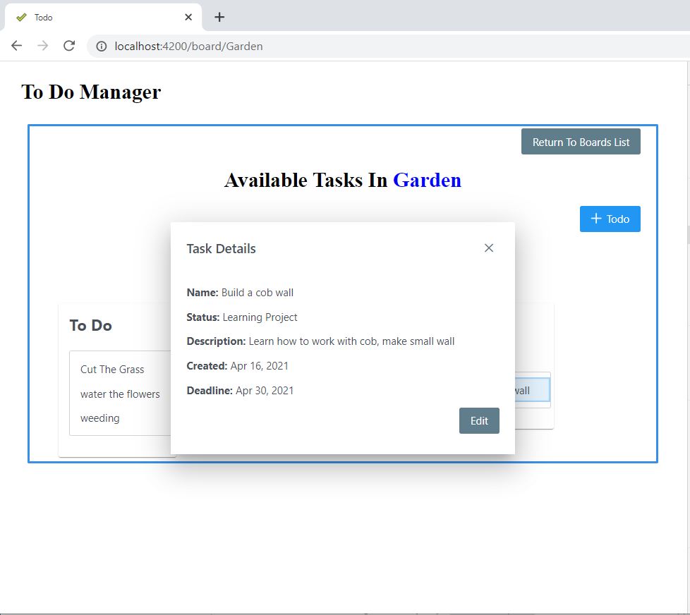
- Click on a task, a dialog opens with the task details
- Local storage can be used
- Styling is not of any importance, just interested in functionality
Video of app running available https://tinyurl.com/angular-todo

Key Features
- Dialog for full task overview inc. edit button to direct to the edit task page
- Success/Error warning to user for successful/unsuccessful submit actions
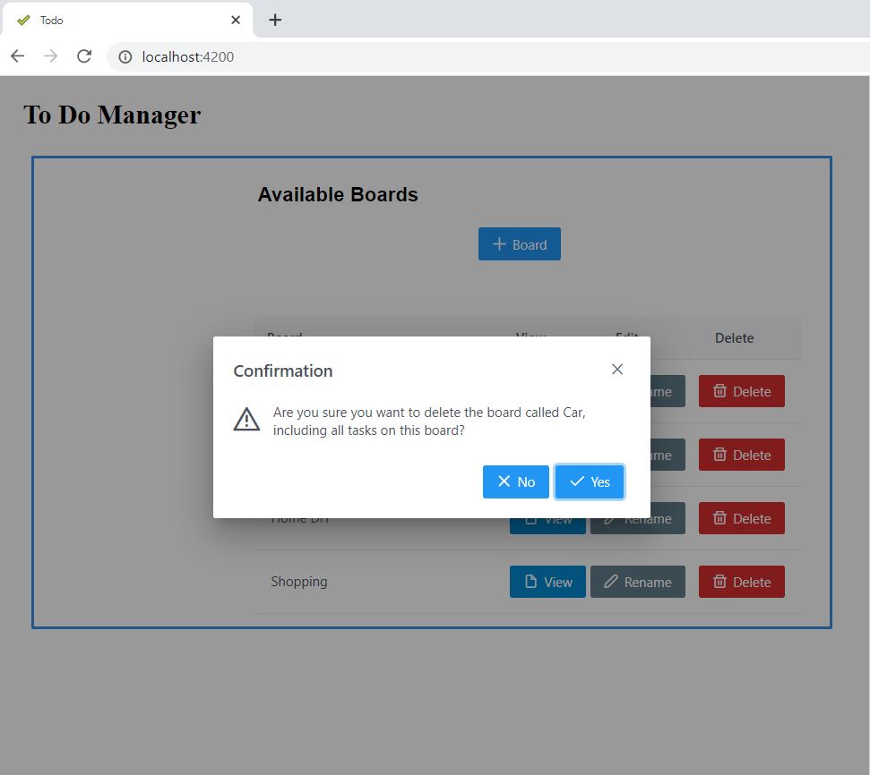
- Confirmation dialog before a board is deleted
- UI component from PrimeNG
- Additional styling in css
- Favicon – tick emoji designed by OpenMoji – the open-source emoji and icon project. License: CC BY-SA 4.0
Data
-
Browser local storage used
- Angular services used to manage data CRUD operations
- RxJS BehaviorSubjects used
- When a board is renamed, the tasks associated with it also get updated to reflect the new board name they belong to
- When a board is deleted, tasks associated with the board are removed from storage also
Forms
- Board Form – Template Driven
- Task Form – Reactive Form
- Form Validation
- Edit/new task, downdown options are created based on the standard 3 options plus, a users own chosen statuses that exist on the board
Take Away Thoughts:
I enjoyed this task, it is always to fun to see components be added or to make an entirely new application. Doing so to a given spec, you always are considerate as to each item specified, are they clearly defined or open to interpretation, have you met the goals from every angle i.e. user experience, functionality and data.
Given the storage type and dataset size (it is only intended as a demo piece) I did not included a loading spinner. In a larger work project, I would implement this.
For testing I test as I go, test with refresh of page, test navigation, check initial state is how I expect, use type safety where possible, include error messages on catch (of try/catch blocks) and consider failed promise or observable work flow. Things I considered here were, what if the board name already exists, what if a board is deleted then you cannot go by the board array length (of data array) for the next new id, what if the last board is deleted, etc.
If I were to make it again from scratch, I would opt for a Firebase backend. This is because it would have saved me some time. Also the workflow in terms of catching errors, having an observable “right off the bat” so to speak, would have made development quicker.
I don’t believe it was a requirement to be able to delete a task. In a real app, maybe a manager or someone would sign it off. The skills to implement such functionality though, I believe are already present in the app.
How much form validation was not included in the spec. I have worked in the past where requirements were just the use of ‘*‘ (situated by form element label) was preferred, as opposed to showing an error message on each element. Both ways are present in this demo app.


